
Introduction
UX UI design services can help prevent the common design problems that make users abandon mobile apps. From confusing navigation and lengthy onboarding to poor accessibility, unclear feedback and difficult forms, small UX/UI mistakes can quickly turn a useful app into a frustrating experience. In this guide, we cover 12 mobile app UX/UI design mistakes businesses should identify early through user research, prototyping and usability testing—before they become expensive to fix during development.
They leave because the app feels confusing, slow, demanding or unreliable. A frustrating first session can undo months of development and paid acquisition in minutes.
It helps users understand where they are, what they can do and what will happen next. Good UI supports that experience through clear hierarchy, familiar controls, readable text and consistent behaviour.
The following mistakes appear across consumer and business apps. They are especially costly because many can be prevented during research, prototyping and usability testing, before custom mobile app development becomes expensive to change.
1. Asking for too much during onboarding
Some apps greet a new user with five tutorial screens, account creation, profile questions, notification prompts and location access before showing any value.
Onboarding should help the user reach the first useful outcome. Ask only for information needed at that moment. Explain why a permission is relevant and delay optional setup until the benefit is clear.
A budgeting app may need the user to select a goal, but it probably does not need a profile photo. A delivery app can request location when the user searches for nearby options, not automatically on launch.
2. Building navigation around the company structure
Internal teams often organise an app around departments, product lines or database categories. Users think in tasks.
A customer does not necessarily know whether a refund belongs under orders, payments, support or account. Navigation labels should use familiar language and reflect what people are trying to accomplish.
Limit the number of primary destinations and keep their meaning distinct. When two tabs appear to lead to similar information, users lose confidence and begin tapping around.
A mobile app development company should test the information architecture with real users before visual design is finalised. Card sorting and task testing can reveal whether the structure makes sense without explanation.
3. Hiding important actions behind unfamiliar icons
Icons save space, but not every symbol is universally understood. A decorative icon may look elegant to the design team and remain meaningless to customers.
Use labels for important actions, especially where a mistake has consequences. A user should not need to guess which icon downloads a file, shares a record or deletes an account.
Familiar platform icons are useful when their meaning is established. Even then, accessible labels should be available for screen readers and other assistive technologies.
4. Making tap targets too small
A control may look neat in a design file and become difficult to use on a moving train, with one hand or for someone with limited dexterity.
Tiny close buttons, tightly packed links and small checkboxes cause accidental taps. They are particularly frustrating in forms and navigation, where the user may lose progress.
Create enough space around interactive elements and test on real devices. Do not rely only on a desktop preview. Apple, Android and accessibility guidance all emphasise controls that are comfortably reachable and distinguishable.
Good UX UI design services consider different hands, vision levels, devices and contexts, not only the ideal user in a quiet room.
5. Using inconsistent patterns
If the same colour means “continue” on one screen and “cancel” on another, the user has to relearn the app continuously. Inconsistent labels create the same problem. “Save”, “Done” and “Confirm” may perform similar actions but suggest different outcomes.
Build a design system with consistent components, spacing, typography, button hierarchy and states. This does not mean every screen must look identical. It means users can predict behaviour.
6. Requesting permissions without context
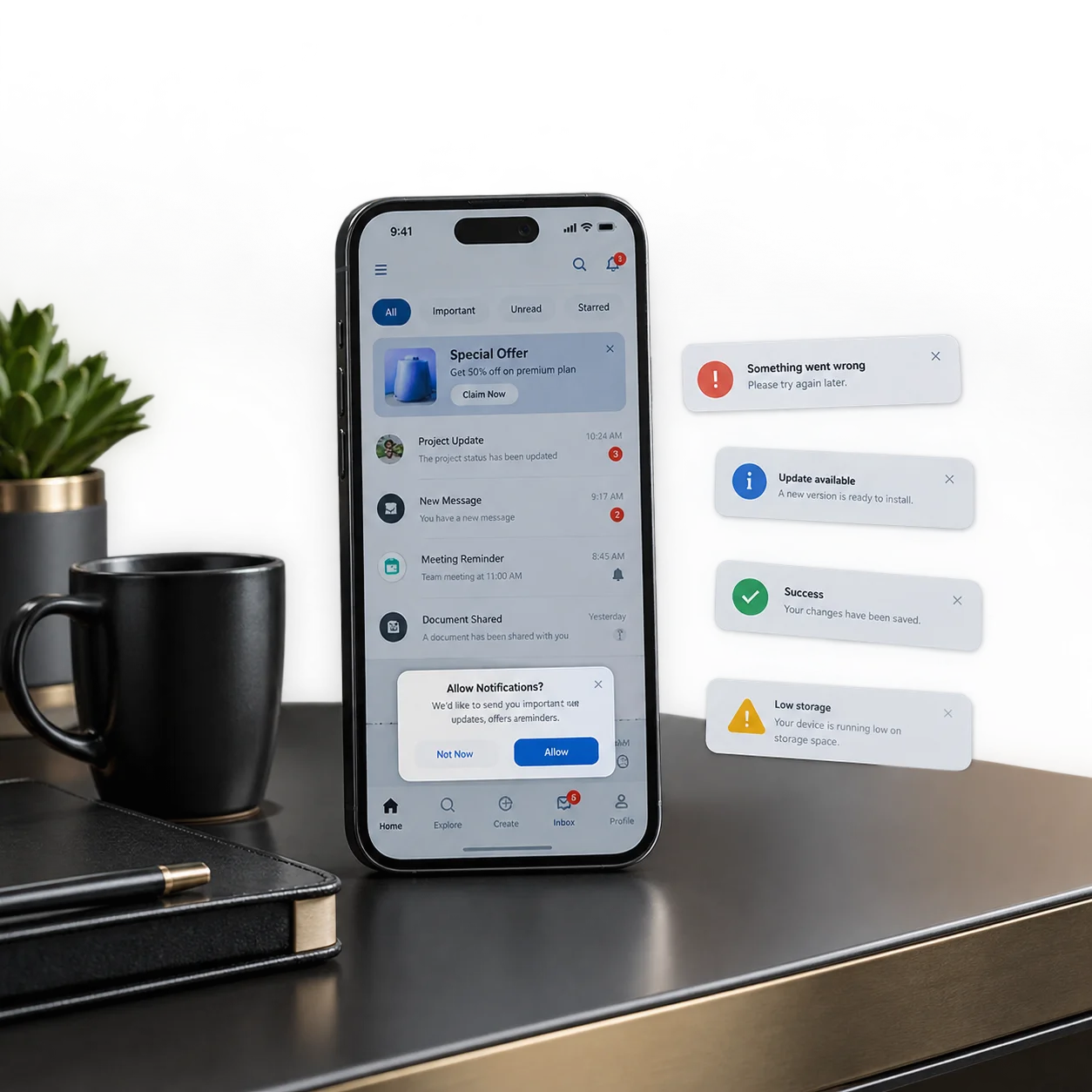
A permission prompt interrupts the user and asks for trust. If it appears before the person understands the benefit, refusal is likely.
Explain the reason in the interface before triggering the system prompt. A fitness app can say that motion access will help track activity. A marketplace can explain that notifications will confirm messages and bookings.
Do not pressure people into accepting optional permissions. The app should still offer a useful experience where possible, and settings should make it clear how permissions can be changed later.
7. Ignoring loading, empty and error states
Design presentations often show screens filled with perfect data. Real apps must also handle the moments before data arrives, when there is nothing to display or when something fails.
A blank screen makes users wonder whether the app is broken. A spinner with no context becomes frustrating when a task takes longer than expected. An error message such as “Something went wrong” provides no way forward.
Useful states explain what is happening and offer the next action. An empty project list can show how to create the first project. A failed upload can preserve the user’s work and offer a retry. A delayed report can set an expectation.
These moments are part of the product experience, not edge cases to design later.
8. Creating inaccessible colour and text choices
Low-contrast text, colour-only status indicators and fixed small type can exclude users with low vision or colour-vision differences. They can also make an app difficult for anyone in bright sunlight or on a poor screen.
Support readable contrast, scalable text and clear focus or selection states. Do not communicate an error only through red. Add an icon and plain-language message.
Screen-reader labels, logical reading order and accessible form controls should be built and tested. Accessibility cannot be achieved by running one automated checker at the end.
Mobile app developers UK organisations hire should understand that inclusive design improves usability for a wider audience and reduces expensive remediation later.

9. Giving no feedback after an action
When a user taps a button and nothing visible happens, they may tap again, leave the screen or assume the app has failed.
Provide immediate feedback. A button can show a loading state, a message can confirm that a payment was successful and a saved item can visibly change state.
Feedback should match the importance of the action. A small toast message may be enough for a preference change. A payment or deletion needs a clearer confirmation.
10. Making forms harder than necessary
Mobile forms become painful when they ask for unnecessary information, use the wrong keyboard, clear data after an error or hide requirements until submission.
Use suitable input types for email, phone numbers and numeric values. Allow autofill where appropriate. Show validation close to the relevant field and preserve correct information when one field needs attention.
Break long processes into sensible stages, but show progress and allow users to go back without losing work.
For sign-up, ask whether every field is essential before the user can receive value. Additional profile information can often be collected later.
11. Copying desktop interactions onto mobile
A mobile app is not a narrow website. Hover states do not exist in the same way, large tables become difficult to navigate and complex sidebars consume valuable space.
Mobile users may rely on gestures, biometrics, cameras, location and notifications. The interface should use platform capabilities when they improve the task, not simply shrink a desktop workflow.
At the same time, avoid hiding essential functions behind gestures that users cannot discover. Swiping can be a helpful shortcut, but there should be a visible alternative for important actions.
An app development company London businesses choose should design around real mobile contexts, including intermittent attention and unreliable connections.
12. Testing only the happy path
Teams naturally test the journey they intended: the user enters valid data, has a strong connection and completes every step in order.
Real behaviour is less tidy. People switch apps, rotate the device, deny permissions, use an old phone, lose signal, enter unexpected characters and return days later.
Test interrupted and unsuccessful journeys. What happens when payment fails? Does a draft remain after the app closes? Can the user recover an account without contacting support? Does the app handle large text settings and screen readers?
Usability testing should include people who are not involved in the project. Internal teams know too much and unconsciously fill in missing information.
Final takeaway
Users abandon apps when the experience asks for too much effort or trust without giving enough value. Clear onboarding, predictable navigation, accessible controls, helpful feedback and well-designed failure states make the product feel dependable.
EMPWR3D provides UX UI design services and custom mobile app development for iOS, Android, Flutter and React Native products. Speak to the team if your app idea needs a user journey that is clear before development begins and remains useful after launch.
Frequently Asked Questions
Q1. What are the most common UX/UI design mistakes in mobile apps?
The most common UX/UI design mistakes include confusing navigation, lengthy onboarding, small tap targets, inconsistent design patterns, poor accessibility, unclear error messages, missing feedback and unnecessarily complicated forms.
Q2. How does poor UX/UI design make users abandon mobile apps?
Poor UX/UI design increases the effort required to complete tasks. When users encounter confusing navigation, slow feedback, difficult forms, unclear errors or inaccessible interfaces, they may become frustrated and abandon the app.
Q3. How can UX UI design services improve a mobile app?
UX UI design services can improve a mobile app by simplifying user journeys, improving information architecture, creating consistent interfaces, strengthening accessibility, designing useful error states and testing experiences with real users before development.
Q4. When should UX/UI design and usability testing begin for a mobile app?
UX/UI design and usability testing should begin before development, during research, user-flow planning and prototyping. Early testing helps identify navigation and usability problems before they become expensive development changes.
Q5. What should businesses consider when choosing UX UI design services?
Businesses should consider user research, mobile UX expertise, accessibility, prototyping, usability testing, design systems and experience across iOS and Android. A strong UX/UI design partner should connect design decisions with user needs and business goals.